Chromatic Alchemy: Blending Colors Beyond the Palette in Chalkboard Art
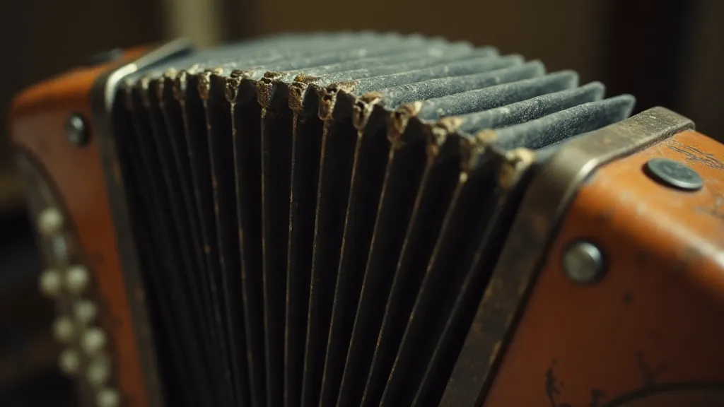
There's a certain melancholic beauty to old things. To me, nothing embodies that feeling quite like an antique accordion. The worn leather, the slightly tarnished metal, the ghosts of melodies trapped within its bellows – they whisper tales of crowded dance halls, traveling musicians, and generations past. Lately, I'm finding echoes of that same feeling in my chalkboard art. It’s not just about rendering pretty pictures; it’s about evoking a mood, a memory, a feeling. And that often means moving beyond the expected, venturing into the world of unexpected color combinations – a sort of chromatic alchemy.
Think about the colors you typically associate with chalkboards: black, white, maybe a touch of red or yellow. They’re perfectly fine, practical even. But limiting yourself to those shades is like playing a simple scale on that antique accordion – technically correct, but missing out on the richness and complexity it’s capable of producing. Chromatic alchemy, in this context, means experimenting with hues and blends to achieve something truly unique, something that resonates with that same sense of aged elegance and heartfelt expression.
A Brief History: From Slates to Art
The history of chalkboards themselves is surprisingly intertwined with that of education and progress. Originally, they were slates – simple pieces of slate upon which students would practice their writing. These were usually dark grey or black, mirroring the slate itself. As industrialization advanced, wooden frames were introduced, and eventually, the familiar blackboard we recognize today came to be. The inherent darkness of the surface demanded a boldness in the chalk, a need for contrast. Early chalkboard artists, often teachers, relied on simple color palettes for clarity. However, as the medium moved beyond classrooms and into the realm of signage and artistic expression, the possibilities expanded.
Consider the traveling salesmen of the late 19th and early 20th centuries. Their signs, often displayed on chalkboards in town squares, needed to be eye-catching, durable, and evocative. While functionality was paramount, there was also an artistic element – a desire to create something that stood out from the noise. Those signs, often weathered and faded, bear witness to a time when craftsmanship and artistry were interwoven into the everyday.
The Palette Beyond the Primary
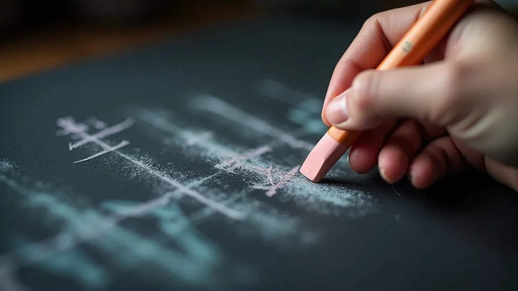
So, how do we step beyond the familiar and embrace this chromatic alchemy? It’s less about following rigid rules and more about observing, experimenting, and trusting your intuition. Let’s think about color theory in a less conventional way. Instead of focusing solely on complementary or analogous colors, think about the *feeling* you want to convey. Are you aiming for a rustic, vintage feel? Consider muted earth tones – ochre, sienna, burnt umber – blended with soft greys and creamy whites. Want something more whimsical and dreamlike? Experiment with unexpected combinations like dusty rose and teal, or lavender and moss green.
The real magic happens in the blending. Layering colors is crucial. Start with a light base color and gradually build up the darker shades. Don't be afraid to mix directly on the chalkboard, creating subtle gradations and textures. Consider using a variety of chalk types – soft pastels for delicate blending, harder chalks for sharp lines and details. A little bit of blending with a cloth or sponge can soften the edges and create a more diffused effect. Think about how old photographs are faded, colors softened by time – try to emulate that effect in your artwork.
There's an art to "distressing" the surface, too. Lightly dragging a damp cloth across the finished artwork can create a sense of age and wear. Or, experiment with different application techniques – a stippling motion for a textured look, a sweeping motion for a more fluid feel. Observe old advertising signs; their colors aren't always perfectly uniform. They have character, history, a story etched into their surface.
Restoration, Reverence, and the Echoes of Time
My interest in restoring antique accordions has profoundly influenced my approach to chalkboard art. Restoration isn’t about erasing the past; it’s about preserving it, about revealing the beauty that lies beneath the wear and tear. Similarly, in chalkboard art, embracing imperfections – a slightly uneven line, a subtle color bleed – can add authenticity and charm. A perfect, sterile image lacks soul.
Collecting accordions has taught me to appreciate the craftsmanship of a bygone era. Each button, each lever, each piece of leather was carefully chosen and meticulously assembled. That same level of care and attention to detail should inform your approach to chalkboard art. Consider the surface you're working on – the texture of the chalkboard itself. Embrace its quirks and imperfections. They are part of its story.
Finding Inspiration: The Language of Decay
Where do you find inspiration for these unexpected color combinations? Look beyond the typical sources. Study old photographs, vintage posters, antique textiles – anything that evokes a sense of history and decay. Observe the colors of nature – the muted tones of a forest floor, the vibrant hues of a sunset. Pay attention to the details – the way light interacts with surfaces, the subtle variations in color. Old maps are an exceptional source; their aged paper and muted palettes offer endless possibilities.
And perhaps most importantly, don’t be afraid to experiment. Chalk is a forgiving medium. If you make a mistake, you can simply erase it and start again. Embrace the process of discovery. Let the colors guide you. Allow yourself to be surprised by the results. That accordion, weathered and worn, still manages to produce a hauntingly beautiful melody – find your own unique voice in the world of chromatic alchemy on the chalkboard.