The Architect of Shadows: Mastering Negative Space in Chalkboard Lettering
There’s a peculiar beauty in the things we consider “empty.” Think of the silent pauses in a beloved piece of music, the breath between a dancer's steps, or the quiet spaces within an antique accordion. The accordion, a marvel of engineering and artistry, isn't just about the bellows’ rise and fall, or the glint of brass keys. It's about the precision of its construction, the deliberate arrangement of its components—and the understanding that the music truly sings within the spaces *between* those elements.
Similarly, in the realm of chalkboard art, and particularly chalkboard lettering, the power isn't solely in the marks we make, but in the intelligent utilization of negative space – the areas around and between the letters. It's the “empty” that breathes life and clarity into the visual message. To become a skilled chalkboard artist is to become an architect of shadows, carefully sculpting the void to highlight the form.

A Legacy of Clarity: Historical Context of Chalkboard Lettering
Chalkboards have a long and venerable history, far beyond their role in classrooms. Early iterations were often slate boards used for public announcements and shop signage. Imagine, in the late 1800s, a shopkeeper meticulously writing out daily specials, not with printed signs, but with a piece of chalk and a practiced hand. The legibility of that lettering, the distinctness of each character, was paramount. It wasn’t merely about conveying information; it was about capturing attention in a world without the constant bombardment of visual noise we experience today.
This emphasis on clarity is inextricably linked to the understanding of negative space. A crowded, cramped inscription would be lost in the bustle of the street. A well-crafted message, with generous spacing and a thoughtful layout, stood out—a silent, yet compelling advertisement.
The Dance of Form and Void: Understanding Negative Space
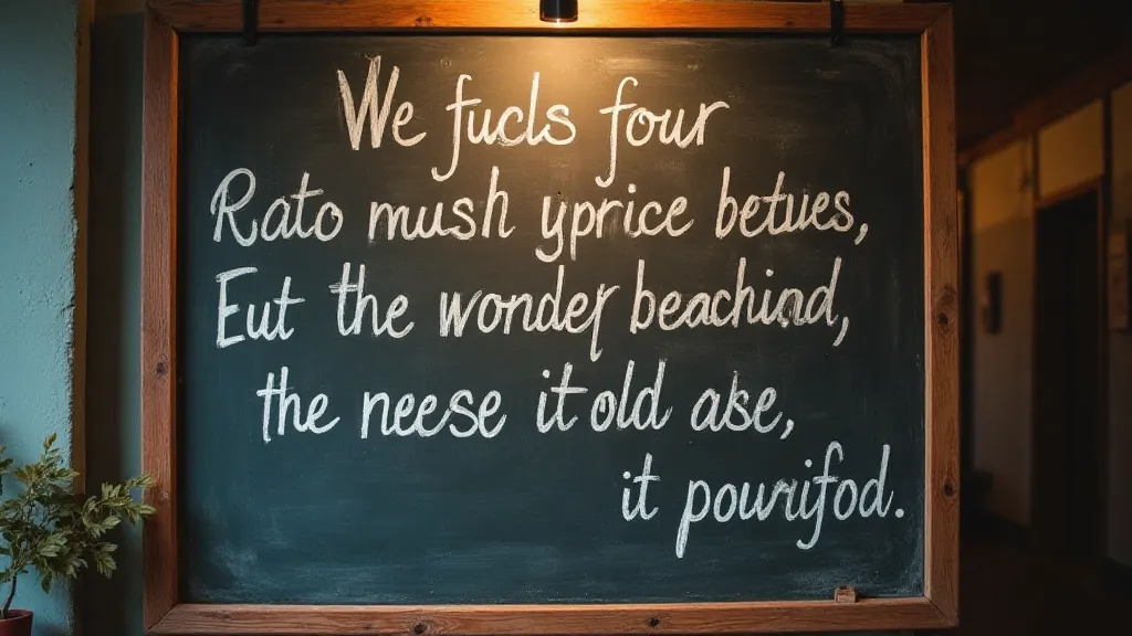
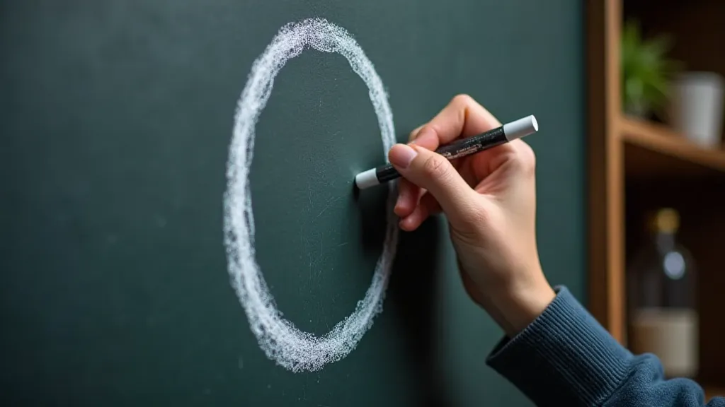
Negative space, in visual art, is the area around and between the subject. In chalkboard lettering, it's the “empty” background surrounding each letterform, and the space within individual letters—the holes in ‘o’ or ‘p’, for instance. Often, beginners instinctively fill this space, fearing a visual weakness. But it is in allowing that space to breathe that the true beauty and readability of the lettering emerges.
Think of it this way: the letterform is the active element; the negative space is its essential partner. Without adequate negative space, the letterforms become mashed together, losing their individual identities and becoming a blurry, illegible mass. Too much negative space, however, and the impression can become disjointed and confusing. Finding the balance—the sweet spot—is the key.
Practical Techniques: Sculpting the Shadow
So, how do you actively manipulate negative space in your chalkboard lettering? It’s not just about leaving a blank area; it’s about *designing* that space.
- Letter Spacing (Tracking): This refers to the space between individual letters. Increasing this space provides visual breathing room, making each letter more distinct.
- Line Height (Leading): The distance between lines of text is equally crucial. Insufficient leading can make large blocks of text feel oppressive.
- Internal Negative Space: Pay close attention to the counters—the enclosed areas within letters like 'o', 'd', and 'b'. Are they open enough? Too tight? Adjusting these internal spaces significantly impacts legibility.
- Shape and Consistency: Maintaining a consistent style of negative space throughout your lettering is important for visual harmony. Experiment with different approaches - rounded counters versus sharp ones – to find what best suits your aesthetic.
Beyond Legibility: Negative Space and Aesthetics
The skillful use of negative space isn’t just about making the lettering readable; it’s about creating a visually compelling and aesthetically pleasing design. Generous negative space can create a sense of elegance, sophistication, and even playfulness. It draws the eye, creates a focal point, and allows the design to “breathe.”
Consider how the negative space can be used to create visual interest – strategically placed shapes, implied lines, or even subtle suggestions of other forms. Just as a musician uses silence to accentuate a musical phrase, a chalkboard artist can use negative space to amplify the impact of their lettering.
The Restoration Parallel: Appreciating the Craft
There’s a lovely parallel between appreciating negative space in chalkboard lettering and restoring antique instruments like accordions. When restoring an accordion, you're not just cleaning and repairing the visible components; you're also preserving the integrity of the construction, the precision of the placement, and the understanding that the instrument’s voice emerges from the interplay of its parts – and the spaces *between* them.
Similarly, in chalkboard art, understanding and utilizing negative space is about recognizing that the true beauty and power of the lettering lie not just in the marks we make, but in the intelligent arrangement of what we *don't* mark. It’s a testament to the enduring appeal of craftsmanship – the appreciation of the space around the object, just as much as the object itself.
Practice and Perception: A Continuous Journey
Mastering the art of negative space in chalkboard lettering is a continuous journey of practice and perceptual refinement. Start by consciously observing lettering in your environment – shop signs, posters, hand-lettered menus. Analyze how negative space is used and how it affects the overall impact. Experiment with different approaches in your own lettering, paying close attention to how it alters the readability and visual appeal.
The rewards are well worth the effort. By becoming a conscious architect of shadows, you're not just creating legible lettering; you're crafting visual art that speaks with clarity, elegance, and a subtle depth of artistry.