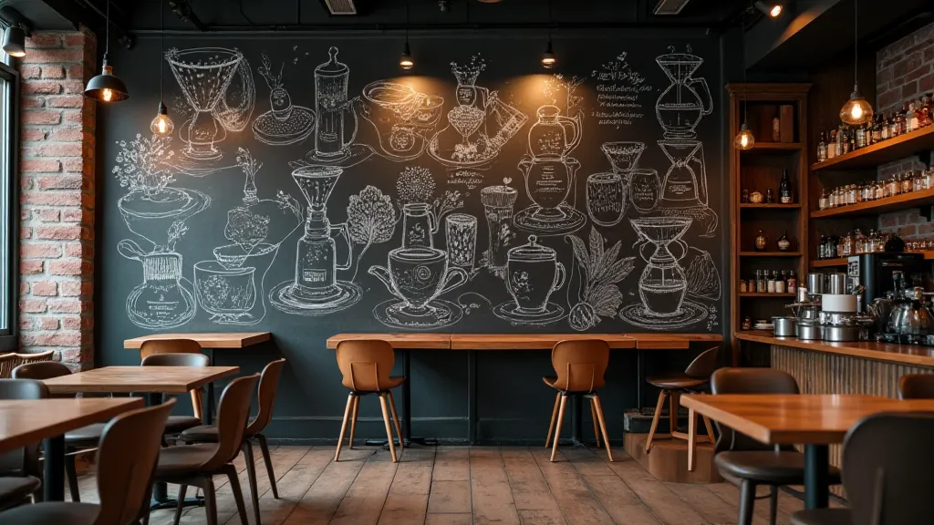
The Echoing Hall: Designing Chalkboard Art for Communal Spaces
There's a resonance to public spaces, a palpable hum of shared experience. Think of a bustling town square, a quiet library corner, the wall of a beloved local cafe. These are places where stories are born, connections are forged, and memories are made. And when we adorn these spaces with chalkboard art, we’re not just creating a decorative element; we’re contributing to that emotional landscape, adding another layer to the shared narrative. This isn’t about flashy visuals; it’s about crafting a visual echo that enhances the atmosphere and invites engagement, regardless of age or background.
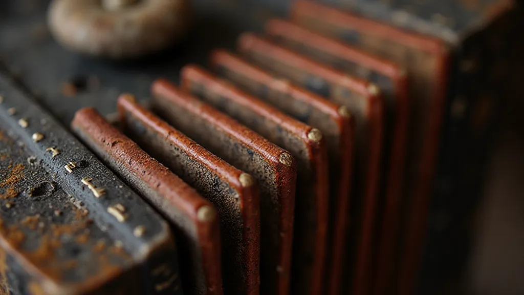
My own fascination with communal spaces and the artistry they can hold began unexpectedly. I inherited my grandfather’s antique accordion. It wasn’t just an instrument; it was a time capsule, resonating with the echoes of his life – the dance halls he played in, the laughter of children he entertained. The bellows, once vibrant and supple, were cracked and dry. The keys were yellowed, some stubbornly refusing to play a note. Restoring it felt like piecing together a fractured memory, coaxing life back into a silent storyteller. The precision involved in repairing those delicate mechanisms – the meticulous cleaning, the patient re-gluing, the careful adjustment – instilled in me a profound respect for craftsmanship, a respect that now deeply informs my approach to chalkboard art.
The Architecture of Shared Experience
Designing chalkboard art for a public space demands a different mindset than creating a piece for a personal collection. The first and most critical consideration is context. What's the purpose of the space? Is it intended for lively interaction, quiet contemplation, or something in between? A playful, dynamic design might be perfect for a children’s play area, while a more restrained, elegant piece would suit a library or a museum café. The existing architectural style plays a crucial role too. Does the art complement the building’s aesthetic, or does it offer a playful contrast?
Scale is paramount. A design that’s charming on a small easel might be illegible and overwhelming when scaled up to cover an entire wall. Legibility for viewers of all ages is equally important. The font size, the thickness of lines, and the overall contrast need to be carefully considered. A child learning to read shouldn’t have to strain to decipher the message. Similarly, an elderly viewer shouldn't need a magnifying glass to appreciate the artwork.
The Language of Chalk and Surface
Beyond the practical considerations, there’s the inherent beauty of the medium itself. Chalk has a unique texture, a slight roughness that invites touch. The softness of the lines, the possibility of layering and blending, lends itself to a sense of immediacy and approachability. Unlike more permanent forms of art, chalkboard art embraces change – it can be erased, reworked, and reimagined. This fluidity reflects the dynamism of the communal space itself.
The surface you’re working on is equally vital. A freshly coated chalkboard provides the best contrast and a smooth writing surface, but older boards can have imperfections that add character. Don’t be afraid to embrace those quirks – they tell a story of their own. Experiment with different types of chalk – soft pastels create a vibrant, blended effect, while hard chalk produces sharp, defined lines. Consider using chalk markers for a more precise and lasting impression.
Lettering for the Collective Eye
Chalk lettering is perhaps the most iconic element of chalkboard art. When designing lettering for a public space, readability is king. Avoid overly ornate or experimental fonts that prioritize aesthetics over clarity. Sans-serif fonts are generally a safe bet – they’s clean, modern, and easily legible from a distance. Experiment with different weights and sizes to create visual hierarchy. A bold, impactful heading can draw the eye, while smaller, more subtle text can provide additional information.
The layout of your lettering is just as important as the font itself. Create a clear visual flow that guides the viewer's eye. Consider using a grid to ensure alignment and balance. Leave plenty of whitespace to prevent the design from feeling cluttered. Think about the overall message you want to convey – is it playful and inviting, or more formal and informative?

Beyond the Message: Creating Atmosphere
While the words themselves are important, the overall atmosphere of the chalkboard art is what truly resonates with the community. A simple quote can be transformed into a work of art through thoughtful design and execution. Illustrations, even simple ones, can add warmth and personality. Consider incorporating elements that reflect the local culture or history. A mural depicting a local landmark, for example, can foster a sense of pride and belonging.
The act of creating chalkboard art can also be a communal experience. Invite local artists to collaborate on the project. Host workshops where community members can learn the basics of lettering and illustration. This not only creates a beautiful piece of art but also strengthens the bonds within the community.
The Echoing Legacy
Restoring my grandfather's accordion wasn’s just about bringing an instrument back to life; it was about preserving a connection to the past, honoring the legacy of craftsmanship, and sharing that history with others. Designing chalkboard art for public spaces is much the same. We're not just creating a visual element; we’re contributing to the collective memory of the community, adding another layer of meaning to the spaces we share.
The transient nature of chalkboard art is part of its charm. It's a reminder that nothing lasts forever, that change is inevitable. But the memories created within those echoing halls, the connections forged through shared experiences – those are the things that truly endure. And it’s those echoes that give chalkboard art its enduring power.